Are you tired of manually moving data around in Excel spreadsheets to analyze it? Well, we have some exciting news for you! Streamlit, a Python library, enables you to create interactive dashboards from Excel spreadsheets. This means you can visualize and analyze your data more efficiently and effectively.

What is Streamlit?
Streamlit can be used to create an interactive dashboard. We can visualize the dataset and make it more interactive with the use of charts and graphs to improve the understanding of the dataset. It is an open-source Python library for creating an effective, informative, and efficient dashboard. Working on Streamlit requires no front-end skills, and it can simply turn data scripts into a shared web application with only a few lines of code.
Why use Streamlit for data visualization?
Streamlit also provides a variety of visualization tools for creating attractive visualizations such as bar charts, line charts, and scatter plots. Developers can utilize these technologies to efficiently represent data and deliver insights. Furthermore, Streamlit dashboards can be quickly installed on platforms such as Heroku, AWS, and Google Cloud Platform.
Installing Streamlit and required libraries:
- Before we begin the project, we need to install Python and the pip dependency management (py -m pip -version) on your command prompt, as well as the Streamlit library (pip install streamlit)
- Install the essential libraries to make your dashboard interactive after installing the Streamlit framework.
Importing libraries & details:
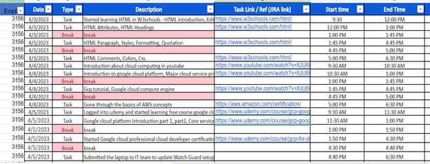
Timesheet.xlsx:

Required libraries that are needed for building your dashboard:
- Streamlit (st) – framework for creating a web application or dashboard
- Pandas (pd) – tool used to read input data sources. .csv file will be used
- Plotly-express (px) – used to produce interactive charts and pie graphs
- Streamlit_authenticator (stauth) – used to authenticate the user login through a series of basic procedures
import pickle #use to save details in the pickle file
from pathlib import Path # use to find files path
import pandas as pd
# pip install pandas openpyxl
import plotly.express as px
# pip install plotly-express
import streamlit as st
# pip install streamlit
import streamlit_authenticator as stauth
We’ll now look at how to use the streamlit library framework to construct an interactive dashboard in Python. Using a standard employee timesheet, we can design a dashboard. Streamlit provides several methods to show text, photos, and maps, as well as capabilities for authoring headers, titles, and markdowns.
Below are the functions and their descriptions:
First, we will set the page config:
st.set_page_config(page_title=”Work TimeSheet Dashboard”,
page_icon=”:bar_chart:”, layout= “wide”)
The streamlit_authenticator may be used to validate the user id and password using basic codes. Using the pickle and pathlib modules, the “Hasher” function is used to encrypt the password and save it in a text file.
names = “”,””,””]
usernames = [“”,””,””]
passwords = [“”, “”, “”]
hashed_passwords = stauth.Hasher(passwords).generate()
file_path = Path(__file__).parent / “hashed_pw.pkl”
with file_path.open(“wb”) as file:
pickle.dump(hashed_passwords , file)
Once the hashed password file is stored, we can read the contents using the path module
file_path = Path(__file__).parent / “hashed_pw.pkl”
with file_path.open(“rb”) as file:
hashed_passwords = pickle.load(file)
After that using Authenticate function I tried to authenticate “User id” and “Password” on the login page.
credentials = {“usernames”: {}}
for un, name, pw in zip (usernames, names, hashed_passwords):
user_dict = {“name”: name, “password”: pw}
credentials[“usernames”].update({un: user_dict})
authenticator = stauth.Authenticate(
credentials, “app_home”, “auth”, cookie_expiry_days=1)
name, authenticator_status, username = authenticator.login(
“Login Here”, “main”)
If the user inputs the proper “User id” and “Password” while verifying the condition, it will go inside the dashboard and read the given Excel sheet to retrieve the dataset and display it on the dashboard.
We will utilize the “Timesheet” dataset in this example, which provides information about various employee attributes. Using Pandas, we will load data from an Excel file.
if authenticator_status == True
# —- READ EXCEL —-
fr = {}
def get_data_from_excel():
df = pd.read_excel(
io=”Timesheet.xlsx”,
engine=”openpyxl”,
sheet_name=”timesheet”,
skiprows=0,
usecols=”A:M”,
nrows=1000,
)
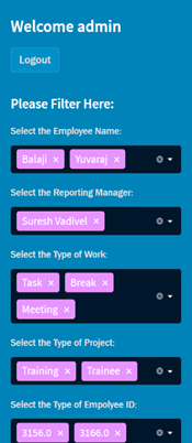
We used sidebar() to display the filter information, username, and some material in this case.
st.sidebar.header(“Please Filter Here:”)
Using the multi-select function in the sidebar to create a select box and the unique() method to filter out duplicate values to display in the charts and main dashboard.
st.sidebar.header(“Please Filter Here:”)
empname = st.sidebar.multiselect(
“Select the Employee Name:”,
options=df[“empname”].unique(),
default=df[“empname”].unique()
)
reportmanager = st.sidebar.multiselect(
“Select the Reporting Manager:”,
options=df[“reportingmanager”].unique(),
default=df[“reportingmanager”].unique()
)
type = st.sidebar.multiselect(
“Select the Type of Work:”,
options=df[“type”].unique(),
default=df[“type”].unique()
)
project = st.sidebar.multiselect(
“Select the Type of Project:”,
options=df[“project”].unique(),
default=df[“project”].unique()
)
empid = st.sidebar.multiselect(
“Select the Type of Empolyee ID:”,
options=(df[“empid”]).unique(),
default=df[“empid”].unique()
)
df_selection = df.query(
“EmpName == @empname & ReportingManager == @reportmanager & Type == @type & Project == @project & EmpID == @empid”)
 In addition, we utilized metric() and title() to display information on the main screen column by column.
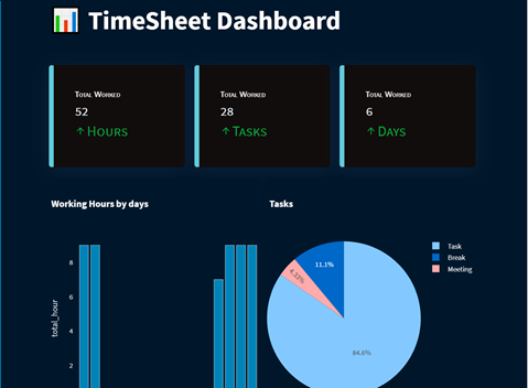
To display the employee’s calculated data, we utilized an algorithm to discover “total worked hours,” “total worked tasks,” and “total worked days.”
user_task_filter = “Task”
user_type_count = 0
for data in df_selection[“type”]:
if data == user_task_filter: user_type_count += 1
st.title(“:bar_chart: TimeSheet Dashboard”)
st.markdown(“##”)
total_hours = int(df_selection[“total_hour”].sum())
total_worked_task = int(user_type_count)
total_working_days = int(
(df_selection.groupby(by=[“date_day”]).sum()).index.size)
left_column, middle_column, right_column = st.columns(3)
left_column.metric(“Total Worked “, total_hours, “Hours”)
middle_column.metric(“Total Worked “, total_worked_task, “Tasks”)
right_column.metric(“Total Worked “, total_working_days, “Days”)
By using the groupby() function, we can group two columns for the graph. We’ve used bar and pie charts to present and visualize the dataset, and we need to choose the x and y axis for the bar charts, as well as the values and titles for the pie charts.
#Working hours by date [BAR CHART]
work_by_days = df_selection.groupby(
by=[“date_day”]).sum().sort_values(by=”total_hour”)
fig_by_days = px.bar(
work_by_days,
x=work_by_days.index,
y=”total_hour”,
title=”Working Hours by days“,
color_discrete_sequence=[“#0083B8″] * len(work_by_days),
template=”plotly_white”,
)
fig_by_days.update_layout(
xaxis=dict(tickmode=”linear”),
plot_bgcolor=”rgba(0,0,0,0)”,
yaxis=(dict(showgrid=False)),
)
# Working hours based on the type of work by the pie chart
fig_Hours_by_Type = px.pie(
df_selection ,
title=”Tasks”,
values = “total_hour”,
names=”type”
)
left_column, right_column = st.columns(2)
left_column.plotly_chart(fig_by_days, use_container_width=True)
right_column.plotly_chart(fig_Hours_by_Type ,use_container_width=True)
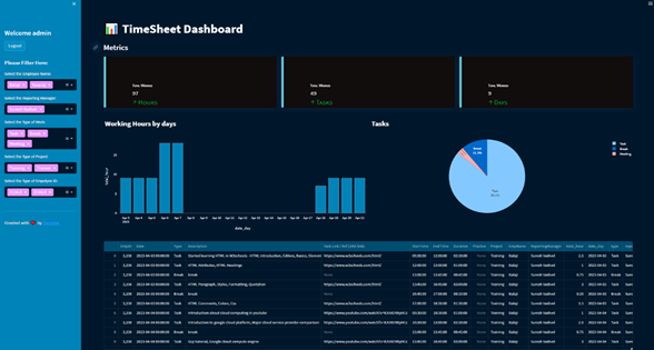
We used Plotly-express to display the graphs and pie charts by utilizing their working hours and the job type.
We can use the dataframe() method to display the filtered date set in the Excel sheet.
st.dataframe(df_selection)

Finally, we can run our Streamlit application in our terminal by typing the following command: streamlit run app.py
Overview:
We created an interactive dashboard using the streamlit library, streamlit authenticator to authenticate the login user, pandas library to read the Excel sheet and access the dataset, pickle and path module to save the hashed password and find the path of the file using the path module, and Plotly-express library to create the bar and pie chart for our needs to make it more interactive.

You can easily share your Streamlit dashboard with others once you have built using your Excel sheet data. It can be deployed on a variety of platforms, including Heroku and Google Cloud Platform. This enables users to access and interact with your dashboard without installing anything on their computer.
Conclusion:
Using an Excel sheet to create a Streamlit dashboard is a fascinating approach to analyze data. It allows for interactive visualization, saving time and enhancing efficiency. With Streamlit, anyone can effortlessly design a professional-looking dashboard and easily share it with others using the right tools and libraries. So, what are you waiting for? Start building your own Streamlit dashboard today!
About the Author:
 Yuvaraj Pandu is a skilled Developer at Sensiple, specializing in the Contact Center practice. With expertise in Python and Node JS, he has made valuable contributions to numerous contact center modernization projects for our customers.
See Also:


